Four-AI-4TRACK-SAS

This sketch is a web-based GPS tracking and AI chat interface called Four-IA 4Track SAS. It combines a conversational AI chat panel with a sidebar for history management, social media links, and theme switching, styled with modern UI elements and micro-interactions.

🧪 Try This!

Experiment with the code by making these changes:

  1. Always use dark theme by default
  2. Make social stars pink instead of gold
  3. Hide the edit button from view
  4. Speed up the star particle animation
  5. Make the sidebar always collapsed
Prefer the full editor? Open it there →

📖 About This Sketch

This project is a full-stack web interface combining AI conversation capabilities with GPS tracking visualization. It features a split-panel design with a collapsible sidebar, dark/light theme switching, animated social media buttons, chat history management, and a main content area for displaying interactive content. The code demonstrates modern web design patterns including CSS animations, responsive layouts, event delegation, and persistent UI state.

The architecture separates concerns into HTML structure, CSS styling with keyframe animations and pseudo-elements, and JavaScript logic for theme management, sidebar toggling, chat history, and particle effects. By studying this code, you will learn how to build professional web dashboards that combine DOM manipulation, CSS animations, localStorage persistence, and event handling into a cohesive user experience.

⚙️ How It Works

  1. When the page loads, the HTML structure creates a sidebar, collapsed rail, main content area, and history panel. CSS defines the layout, colors, and animations. JavaScript initializes the theme from localStorage and sets up event listeners.
  2. The sidebar can be toggled between expanded and collapsed states using a button. When collapsed, it becomes a narrow rail with icon-only links. The width transition is animated with CSS.
  3. The theme toggle switches between 'light' and 'dark' modes by changing the data-theme attribute on the body element, triggering CSS cascades that update all colors. The selected theme is saved to localStorage and restored on page reload.
  4. Social media buttons trigger hover animations: YouTube stars fly outward with rotation, Instagram and Facebook buttons scale up with a pop effect. Particle effects float upward when users interact with elements.
  5. Chat messages are displayed with different bubble styles for user vs bot messages. An edit button appears on hover for user messages, allowing inline message modification.
  6. The history panel shows past conversations. Each history item can be renamed via a pencil icon, and conversations can be selected to load previous context.

🎓 Concepts You'll Learn

DOM manipulationCSS animations and keyframesEvent listeners and delegationlocalStorage API for persistenceCSS custom properties and cascadingResponsive design with flexboxTheme switching with data attributesPseudo-elements for particle effects

📝 Code Breakdown

Theme Toggle System

This pattern uses localStorage as a simple database to remember user preferences across sessions. The data-theme attribute is a CSS-friendly hook that allows all color rules to update simultaneously with a single attribute change.

// Theme initialization and toggle
const theme = localStorage.getItem('theme') || 'light';
document.body.setAttribute('data-theme', theme);

// Toggle button listener (pseudo-code structure)
document.getElementById('theme-toggle').addEventListener('click', function() {
  const currentTheme = document.body.getAttribute('data-theme');
  const newTheme = currentTheme === 'light' ? 'dark' : 'light';
  document.body.setAttribute('data-theme', newTheme);
  localStorage.setItem('theme', newTheme);
});
Line-by-line explanation (4 lines)

🔧 Subcomponents:

calculation Theme Persistence localStorage.getItem('theme') || 'light'

Retrieves the user's last selected theme from browser storage, defaulting to 'light' if never set

conditional Theme Application document.body.setAttribute('data-theme', newTheme)

Sets the data-theme attribute which CSS rules use to cascade color changes across the entire page

const theme = localStorage.getItem('theme') || 'light';
Reads the 'theme' value from browser's localStorage, or uses 'light' if it doesn't exist - this survives page reloads
document.body.setAttribute('data-theme', theme);
Sets the data-theme attribute on the body element to 'light' or 'dark', triggering CSS rules that match [data-theme='light'] or [data-theme='dark']
const newTheme = currentTheme === 'light' ? 'dark' : 'light';
Toggles the theme: if currently light, switch to dark; if dark, switch to light
localStorage.setItem('theme', newTheme);
Saves the new theme choice to localStorage so it persists when the user closes and reopens the browser

Sidebar Toggle System

This uses classList.toggle() to switch a CSS class on and off. The actual visual change (width transition, color shift) happens in CSS, not JavaScript. This separation keeps code clean and makes animations reusable.

// Sidebar expansion/collapse
const sidebar = document.getElementById('sidebar');
const collapsedRail = document.getElementById('collapsed-sidebar-rail');
const toggleButton = document.getElementById('sidebar-toggle');

toggleButton.addEventListener('click', function() {
  sidebar.classList.toggle('collapsed');
  collapsedRail.classList.toggle('visible');
});
Line-by-line explanation (4 lines)

🔧 Subcomponents:

conditional Class Toggle sidebar.classList.toggle('collapsed');

Switches the 'collapsed' class on or off, which CSS uses to change width and visibility

const sidebar = document.getElementById('sidebar');
Caches a reference to the sidebar element so we can modify it later without searching the DOM again
toggleButton.addEventListener('click', function() {
Attaches a listener so when the user clicks the toggle button, the function body runs
sidebar.classList.toggle('collapsed');
Adds the 'collapsed' class if missing, or removes it if present - CSS rules then hide/show content based on this class
collapsedRail.classList.toggle('visible');
At the same time, shows or hides the narrow icon-only rail so the UI always has a compact state available

Particle Effects on Hover

Pseudo-elements (::before, ::after) are invisible DOM nodes that CSS can style and animate. They're perfect for decorative effects because they don't clutter the HTML. CSS variables (--tx, --ty) let you reuse the same animation keyframes with different values.

// Particle creation on social button hover (pseudo-code from CSS animation)
.social-youtube:hover .yt-particles::before,
.social-youtube:hover .yt-particles::after {
  content: '★';
  position: absolute;
  font-size: 10px;
  color: #ffd700;
  top: 50%; left: 50%;
  animation: yt-star-fly 0.7s ease-out forwards;
}

@keyframes yt-star-fly {
  0%   { opacity:0; transform: translate(0,0) scale(0) rotate(0deg); }
  30%  { opacity:1; }
  100% { opacity:0; transform: translate(var(--tx),var(--ty)) scale(1.3) rotate(var(--tr)); }
}
Line-by-line explanation (5 lines)

🔧 Subcomponents:

calculation Staggered Particles animation-delay: 0s; animation-delay: 0.1s;

Different particles start at different times so they don't fly out simultaneously

calculation CSS Variables for Trajectory --tx: -18px; --ty: -14px; --tr: -30deg;

Sets unique translation and rotation values for each particle so they fly in different directions

.social-youtube:hover .yt-particles::before {
When the user hovers over a YouTube button, the ::before pseudo-element triggers (no DOM element needed, pure CSS)
content: '★';
Pseudo-elements can display text or Unicode characters - here a gold star emoji appears at the trigger point
animation: yt-star-fly 0.7s ease-out forwards;
Runs the yt-star-fly animation for 0.7 seconds, easing out so motion slows at the end, and forwards keeps the final frame visible
0% { opacity:0; transform: translate(0,0) scale(0) rotate(0deg); }
At animation start, the star is invisible (opacity 0), tiny (scale 0), and centered
100% { opacity:0; transform: translate(var(--tx),var(--ty)) scale(1.3) rotate(var(--tr)); }
By animation end, the star has moved to (--tx, --ty) position, grown 30% larger, rotated, and faded out - the --vars are substituted from line with --tx: -18px

Message Edit Button on Hover

This pattern chains multiple hover states: first hover the message, then hover the button. It demonstrates CSS specificity (.msg.user:hover targets the parent) and how :hover can work on nested selectors. The opacity transition makes the appearance smooth rather than jarring.

.msg.user { position: relative; }
.msg.user:hover .msg-edit-wrap { opacity: 1; }
.msg-edit-wrap {
  position: absolute;
  top: 4px;
  right: calc(100% + 6px);
  opacity: 0;
  transition: opacity 0.2s;
}
.msg-edit-btn {
  background: rgba(37,99,235,0.15);
  border: 1px solid rgba(37,99,235,0.25);
  color: #60a5fa;
  cursor: pointer;
  padding: 5px 7px;
  transition: background 0.2s, transform 0.15s;
}
.msg-edit-btn:hover { background: rgba(37,99,235,0.3); transform: scale(1.1); }
Line-by-line explanation (6 lines)

🔧 Subcomponents:

conditional Show on Hover .msg.user:hover .msg-edit-wrap { opacity: 1; }

Edit button appears only when user hovers over their message, keeping the UI uncluttered

calculation Positioning right: calc(100% + 6px);

Places edit button to the left of the message with calc() math so it scales responsively

.msg.user { position: relative; }
Sets position relative so child elements (like msg-edit-wrap) can be positioned absolute relative to this message
.msg-edit-wrap { opacity: 0; }
Edit button wrapper starts invisible (opacity 0) and won't respond to clicks
.msg.user:hover .msg-edit-wrap { opacity: 1; }
When user hovers over a user message, the button inside becomes visible (opacity 1) smoothly via the transition
right: calc(100% + 6px);
Positions button at 100% of parent width plus 6px to the right, so it sits just outside the message bubble
transition: opacity 0.2s;
Any change to opacity will animate over 0.2 seconds instead of jumping instantly
.msg-edit-btn:hover { transform: scale(1.1); }
When user hovers over the button itself, it grows 10% larger to show it's clickable

📦 Key Variables

theme string

Stores the current theme mode ('light' or 'dark') from localStorage or defaults to 'light'

const theme = localStorage.getItem('theme') || 'light';
data-theme attribute string

HTML attribute on the body element that holds 'light' or 'dark', used by CSS rules to cascade color changes

document.body.setAttribute('data-theme', 'dark');
--tx, --ty, --tr CSS variables CSS custom properties

Store translate X/Y and rotation values for particle animations, allowing the same keyframes to produce different trajectories

--tx: -18px; --ty: -14px; --tr: -30deg;

🔧 Potential Improvements (5)

Here are some ways this code could be enhanced:

STYLE CSS variable naming

Particle animation variables use abbreviated names (--tx, --ty, --tr) which are harder to read at a glance

💡 Rename to --translateX, --translateY, --rotationDegrees for clarity, though --tx is acceptable shorthand once you understand the pattern

FEATURE Theme system

Only two hardcoded themes (light/dark); no system preference detection

💡 Add const prefersDark = window.matchMedia('(prefers-color-scheme: dark)').matches; to respect OS dark mode settings if user hasn't set a preference

PERFORMANCE Sidebar toggle listener

No debouncing on toggle click; rapid clicks could cause multiple class additions/removals

💡 Add a disabled flag or debounce timer to prevent toggle conflicts if user clicks rapidly

STYLE Message bubble colors

Dark theme message colors not fully defined in the provided code snippet

💡 Ensure all message bubble states (user, bot, hover) have explicit colors for both light and dark themes to prevent contrast issues

FEATURE Particle effects

Particle animations are hard-coded per social platform (YouTube stars, Instagram/Facebook pop)

💡 Create a reusable particle system that can be applied to any hover-able element, reducing CSS duplication

🔄 Code Flow

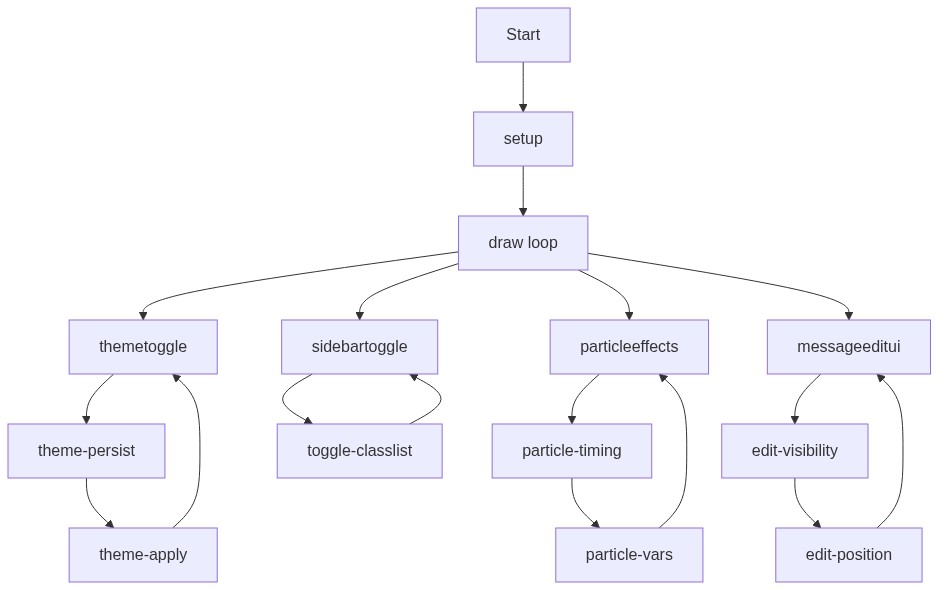
Code flow showing themetoggle, sidebartoggle, particleeffects, messageeditui

💡 Click on function names in the diagram to jump to their code

graph TD start[Start] --> setup[setup] setup --> draw[draw loop] draw --> themetoggle[themetoggle] draw --> sidebartoggle[sidebartoggle] draw --> particleeffects[particleeffects] draw --> messageeditui[messageeditui] click setup href "#fn-setup" click draw href "#fn-draw" click themetoggle href "#fn-thetetoggle" click sidebartoggle href "#fn-sidebartoggle" click particleeffects href "#fn-particleeffects" click messageeditui href "#fn-messageeditui" themetoggle --> theme-persist[theme-persist] theme-persist --> theme-apply[theme-apply] theme-apply --> themetoggle sidebartoggle --> toggle-classlist[toggle-classlist] toggle-classlist --> sidebartoggle particleeffects --> particle-timing[particle-timing] particle-timing --> particle-vars[particle-vars] particle-vars --> particleeffects messageeditui --> edit-visibility[edit-visibility] edit-visibility --> edit-position[edit-position] edit-position --> messageeditui click theme-persist href "#sub-theme-persist" click theme-apply href "#sub-theme-apply" click toggle-classlist href "#sub-toggle-classlist" click particle-timing href "#sub-particle-timing" click particle-vars href "#sub-particle-vars" click edit-visibility href "#sub-edit-visibility" click edit-position href "#sub-edit-position"

Preview

Four-AI-4TRACK-SAS - p5.js creative coding sketch preview
Sketch Preview
Code flow diagram showing the structure of Four-AI-4TRACK-SAS - Code flow showing themetoggle, sidebartoggle, particleeffects, messageeditui
Code Flow Diagram